
When Missy Whidden's email showed up in my inbox with this project I literally gasped out loud. For the love of PURPLE!! Who would have thought a page so beautiful could be created with a color that seems to be taboo :) Check this layout out, isn't it amazing?
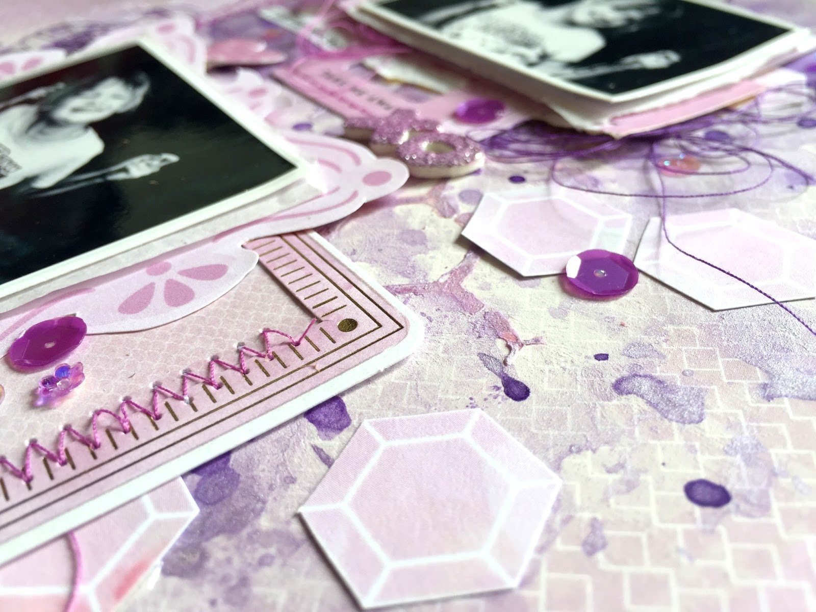
Hey there friends! Missy here and this week we are focusing on monochromatic layouts. I decided on the color purple because I like a challenge :) I sorted through all the papers from the Take Me Away collection and found all sorts of purple shapes and images. I fussy cut them all out, including all those fun hexagons from Paper 16. I couldn’t resist using Paper 15 as my background - that gorgeous lavender ombre is just beautiful. My photos are of my youngest daughter swinging and I printed them in black & white so they would stand out against the soft purples. To add different shades of purple to my background, I used three different purple watercolors. I first coated the center of my paper with gesso in a vertical design then I used the packaging technique to apply the watercolors and used my brush to create some splatters.

I used all the fussy cut pieces as random layers. I cut a few windows from Paper 13, some 3x4 frames from Paper 24, and a few labels and lists from Paper 11. I also pulled a few pieces from the Ephemera Die Cuts. It was almost like putting a puzzle together with all the layering. I added the hexagons around the edges of the design in a random order. I did do some machine stitching in a few places with purple threads and I added a few sequins from my stash for extra pops of purple. I wanted to add a bit of sparkle to the page so I used a purple gelato to color the Fancy Free Glittered Foam Thickers. It’s super easy to do and you can customize them with any color you want. I just scribbled the gelato onto the sticker and rubbed it in with my finger.

Here you can see the texture on the background with the gesso and watercolors. Sometimes it’s fun to create a messy and artsy background - it can really enhance your photos and make them stand out. I added some adhesive foam under the pictures as well to give them some dimension. I like how the hexagons are very subtle and blend in with the background, yet they are still visible and add just the right detail.
I went light on the journaling and just printed a few sentences on my computer. One of my favorite things about this layout is that I was able to use bits and pieces that I don’t think I would’ve used otherwise. Using pieces like the windows and lists seemed like a challenge for me, but when I can work them in as layers it makes it a lot easier. You don’t always have to use certain images as they’re intended.

I hope this gives you some ideas on what you could do for a monochromatic layout. It limits what you can use so you’re able to really stretch your creativity!
SUPPLIES: TAKE ME AWAY: 12x12 Paper Pad, Paper 11, Paper 13, Paper 15, Paper 16, Paper 24, Ephemera Die Cuts, Buttons; FANCY FREE: Glittered Foam Thickers

Blog: littlenuggetcreations.blogspot.com Instagram: @missywhidden Pinterest: @missywhidden
Facebook: missy.whidden YouTube: Missy Whidden
Facebook: missy.whidden YouTube: Missy Whidden
Now I challenge YOU to create a monochromatic layout! Pull similar colored things from your stash and use them! The texture the color-on-color creates is always striking!

Love this page -so lovely with all the purple. Lots of ideas to try especially the gelato on the Thickers!
ReplyDeleteThis is GORGEOUS! LOVING the colors and the frames!!!!!!!!!!!!!!!!!!!!!!!!!
ReplyDeleteNice.
ReplyDelete