Good Morning Beautiful Layout for February #moodboardgirls


Saturday, February 3, 2018

So happy to be back with the Moodboard Girls sharing another layout!!
 
I've used my new Pick-Me-Up collection to create this layout. I started by adding white acrylic paint to the B-side of Paper 23 and splashed on some purple watercolors. Then I used my Silhouette Cameo 3 to die cut the title "Good Morning Beautiful" by Amanda Arneill from Paper 17. I used spray adhesive to attach the die cut in place and then spent some time piercing holes around it for hand stitching.
Then came the crazy part of stitching! I used about 15 different colors of purple threads and changed colors every 10 stitches. I should have just used variegated thread lol. That would have saved a lot of time and perhaps even looked better with the subtle changing of colors. Next time!
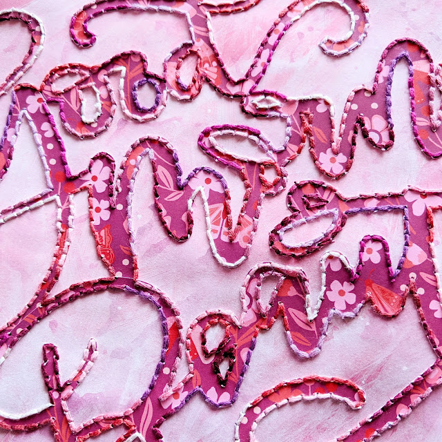
Once the stitching was finished and before embellishing, I used a white pen to add highlights under the stitching to help the title stand out even more.
 I took photos of Jane when she woke up in the morning - so the pictures were taken specifically for this layout! Janey's bedding has lots of purples so it coordinated perfectly. I added two clusters of embellishments at the top and bottom corners of the page using all kinds of stickers: Chipboard StickersStickers, and Puffy Stickers  - Jane loves every and any kind of bird so I used a pair of storks. I wrote my journaling with a precision pen on a Journaling Spot and tucked it under the left photo.
I hope you are inspired in some way from this layout! Hope to be back again soon playing along with the Moodboard Girls!

Cinque Terre Mini Album


Friday, February 2, 2018

I started this mini album about our adventure to the Cinque Terre in Italy last May when I was on my first mini album making kick, but then I got overwhelmed by the sheer size of it and put it on the backburner!! Then a few weeks ago I picked it up again and decided, hey, it doesn't need to be AMAZING! I already had the hardest part done which was printing the photos, picking the papers, and arranging everything into the right order. All it really needed was embellishments and journaling - NOTHING FANCY! Not everything has to be FANCY! Sometimes it's just about getting the memories documented and if it turns out pretty, that's a bonus :)
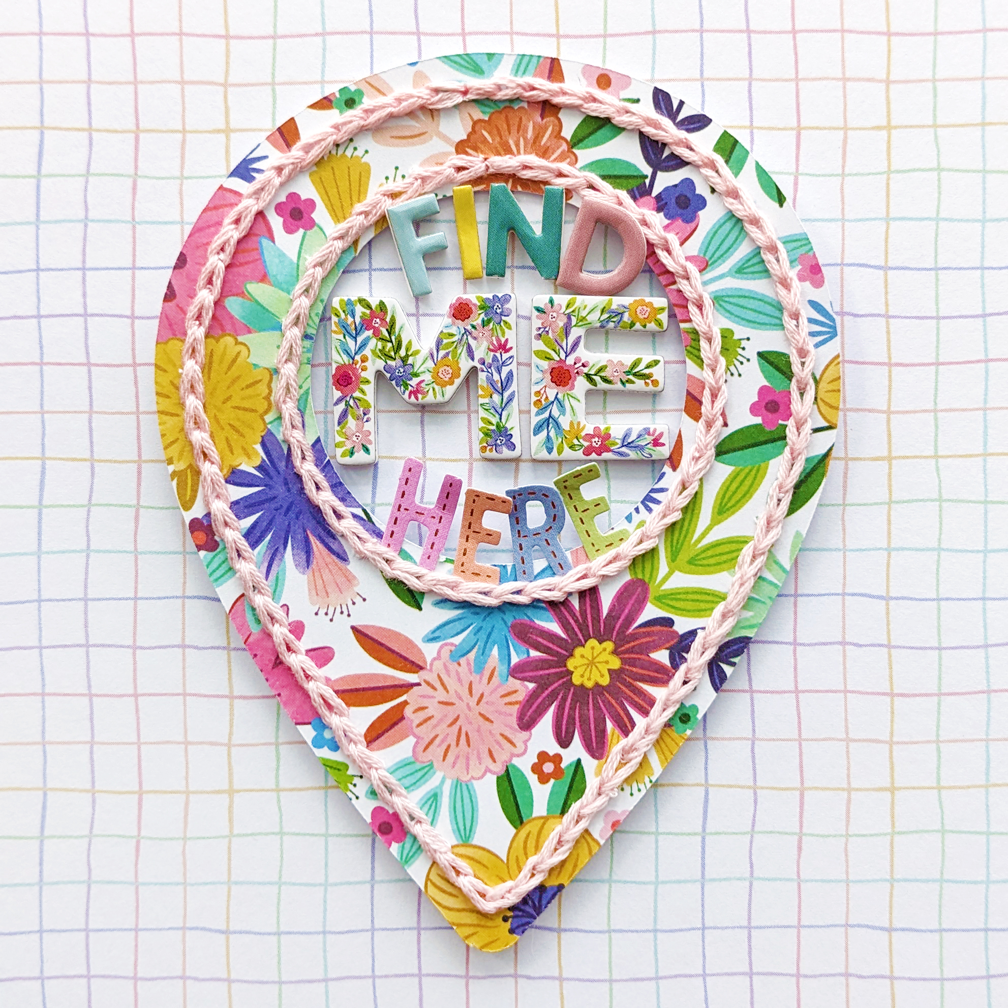
This is actually the second version of the cover, the first had lots of layering of random things but it just didn't feel right. Another reason I struggled... it just wasn't clicking from the get-go! I decided to switch it up and do something I love on the cover which is hand stitching! Much better and much more "me"!:)

The entire mini album is made from Maggie Holmes' collections. I have hoarded every single one of her lines since the first one came out back in January 2013 - I even found the blog post revealing it on Crate Paper! It's all just so pretty :) And the beautiful colors, florals, and vintage patterns match perfectly with the vibes of the Cinque Terre!

I have a short flip through if you want to see this album "live". I didn't talk through the video, just played some music in the background.
More about the album - I mixed in a few transparencies here and there, below is a plain one from American Crafts, and I used a special white pen to write the journaling. There are five cities in the Cinque Terre (translated to English it means "five lands") and for each of the five cities I made an intro page with its number on the tourist route. Riomaggiore was city #1 and where we rented our airbnb.
I took sooooooo many photos throughout the day whilst exploring. I mean. THE COLORS!! So this album has 38 spreads so I could include all my favorite photos. My most favorite pictures I printed to 4x6 and a select few are even the full 5x7". The rest are 2x2 and inserted into pocket page protectors. You'll see :)
When I got these photos printed we still lived in Germany and I wanted to get full 5x7s for some for impact, but Europe has a different sizing system than we do so I accidentally ended up with about 20 11x14" pictures hahaha! So eventually I want to frame and hang them. Anyway back to the mini album, I printed an introduction on vellum and stitched three pennants below - super simple. I copied and pasted the text straight from my blog.
Pocket pages to the rescue! I LOVE this format and size and then adding embellishments like sequins to some of the pockets without photos.
I fussy cut a few butterflies from a patterned paper and scattered them directly on this photo for whimsy.
This was the last spread I made before I gave up last year. I wasn't loving anything, it didn't feel like "me", so I put it in a basket and moved on to other things. When I picked up this mini album a few weeks ago after letting it sit for 7 months, I realized it didn't look as bad as I remembered. It might not be as intricate as my layouts, but THAT'S OKAY!!! More than any individual spread, it's about the mini album as a whole and by keeping it pretty simple, the overall thing makes me happy.
Sometimes I didn't know where to add journaling so I made interactive tags.
Pesto was invented just a couple cities over! We had to get some fresh. So yummy.
City #2 - Manarola!
A 4x6 photo with typed/printed/trimmed journaling and a couple pocket pages filled to the brim with photos and goodies.
This right photo is probably my favorite picture from the entire day. How is this place real?!
I really wanted to keep adding #allthethings but even more so I just wanted to finish and to do that I had to keep it simple. Four stickers on this spread (three banners and a sentiment) and DONE.
All I added to the left page was a strip of gold glitter washi and the right page is a 2.5" pocket page with embellishments and journaling.
I got my layering game on a few times. For inspiration I looked through Maggie's minis and saw how she used her own product in pretty ways.
For city #3's opening page I placed the number and title on a gold glittered hearts transparency and added machine stitching to keep everything in place.
More interactive elements: I stapled perforated tickets that you lift to see the journaling underneath.
The right page is a scaplift from Maggie.
A full-page photo of sweet Jane on the left and a coordinating blue plaid paper on the right with a few stickers of things I know she would love = swans and birds.
Flowers galore!
Also lots of banners and pennants throughout the album - it's good to have cohesive elements and they add pops of color to match all the colors of the photos.
This pocket is a perfect place for a tag with journaling.
Seriously, these collections couldn't match any more perfectly with the Cinque Terre! Here is the opening for city #4 - Vernazza.
No photo spread! A flower on the left and stamped journaling lines and hearts with handwritten journaling on the right. Done and done!
I busted out my Cuttlebug for the first time in ages and used embossing folders that I've held onto for years but don't think I've actually used until now! I love the texture!! I cut a piece of embossed paper into 2" squares and added them between photos in the pocket page.
In the white space at the top of the full-page photo on the right I added a floral sticker with the most perfect colors to match the buildings and a sentiment sticker cut in two.
Birds, flowers, leaves, banners... the works!
Here comes four 4x6" photos which I glued back-to-back and stapled folded over tabs at the top to help make turning them easier.
A single sentiment adhered in the middle is all this spread needed!
My cute little boy! I found all the black and white things I could to fit inside these frames.
This page is a little fancier than most - it's the intro for city #5 - Monterosso al Mare and on the left side I adhered sequins to the pattern and stitched through gold foil Thickers on the right.
Since the stitched lines showed through on the other side I added typed/printed/trimmed journaling between. For the past few years I ALWAYS use a font called Remington Noiseless recommended by Ali Edwards. I love how it looks like a typewriter. In the right pocket page I added journaling to tags and tucked them behind a couple of the photos.
We took a few videos throughout the day so I compiled them all into one video, uploaded it to Chris' YouTube, and created a QR code link which with an app takes you directly to the video. Gotta love technology!
Thank goodness for so many flowers in all of Maggie's collections! They're so beautiful and I added them everywhere!
The final spread is of me and my love with some final thoughts and a stacked suitcases sticker - perfect for a mini album about traveling!
Whew! Finished!

I hope you picked up a few ideas and can echo my thoughts of "it's okay to not go over the top with #allthethings and #allthetechniques"! Sometimes less is more and the fact that I got this done instead of just letting it sit is a major accomplishment in my book! Thanks for stopping by!

5 Layout by Stefanie Ried


Thursday, February 1, 2018

Every year Stefanie Ried makes a layout for her sweet daughter's birthday which is coming up soon so here is her age five edition using Pink Paislee Pick-Me-Up!
My daughter will be 6 years old next week! Why is time passing so fast? But before it's all about her birthday, I made a layout with pictures from last year.
I wanted the number in the center so I cut it out from white cardstock using my Silhouette Cameo. At first I wanted to keep the number white. But then I decided to back it with Paper 23 - I really like the ombre effect and the number is highlighted even better!

Next I fussy cut bows, drinks, lemons, emojis, moths, flowers, and leaves from Paper 03Paper 04, Paper 07Paper 08Paper 14, and Paper 23. There are sooo many beautiful designs and icons on these papers.

Then I applied a little color on the edge of the number with watercolors and sprays. After that, many motifs, StickersChipboard StickersPuffy StickersHaberdasheryRub-OnsMini ThickersChipboard Thickers, and photos were glued/applied around the number.

Many thanks for stopping by! I hope you love it! 

Blog: steffiried.blogspot.com / Instagram: @steffiried / Pinterest: @steffiried / Facebook: stefanie.ried.96 YouTube: Steffi Ried
So many heart eyes for this pretty layout!!! So many fun elements to look at all around the number!
Paige Taylor Evans © // Quinn Creatives DESIGN